

Charvin oil paints have a great reputation and I am very pleased to say that we now stock these gorgeous paints at Jackson’s. Charvin have a long tradition of producing artists’ oil colour using high quality ingredients and traditional processes. The thing they are most famous for is their huge range of colours, of which Jackson’s stock over 150. It reminds me of the wide range of scrumptious colours in a soft pastel painting palette. To try them out and see what they were like, I made some colour charts and two small paintings and found the best way to use them is with the prepared palette method, no colour mixing and not much blending on the canvas.

A few of the Charvin blues and greens.
Blues L-R: Ultramarine Blue Deep, Royal Blue, Charron Blue, Bright Linen, Ash Blue, Lagoon Blue, Deep Turquoise Blue, Caraibes.
Greens L-R: Water Green Deep, Saint Remy Green, Anise, Olive Green, Cinnaber Green, Bamboo Green, Absinthe Green, Intense Viridian.
Charvin Oil Paints
Established in 1830 and based in Cannes on the French Riviera, Charvin Extra Fine Artist Oil colours are made according to some of the oldest recipes still in use. The highest possible concentration of pigment is combined with a blend of oils, primarily poppy oil, which is non-yellowing. They have made oil colours for such artists as Cezanne, Bonnard, and Ambrogiani. Charvin uses Swiss tri-cylinders from Buhler, machines that are used in the manufacture of top-of-the-range cosmetics.
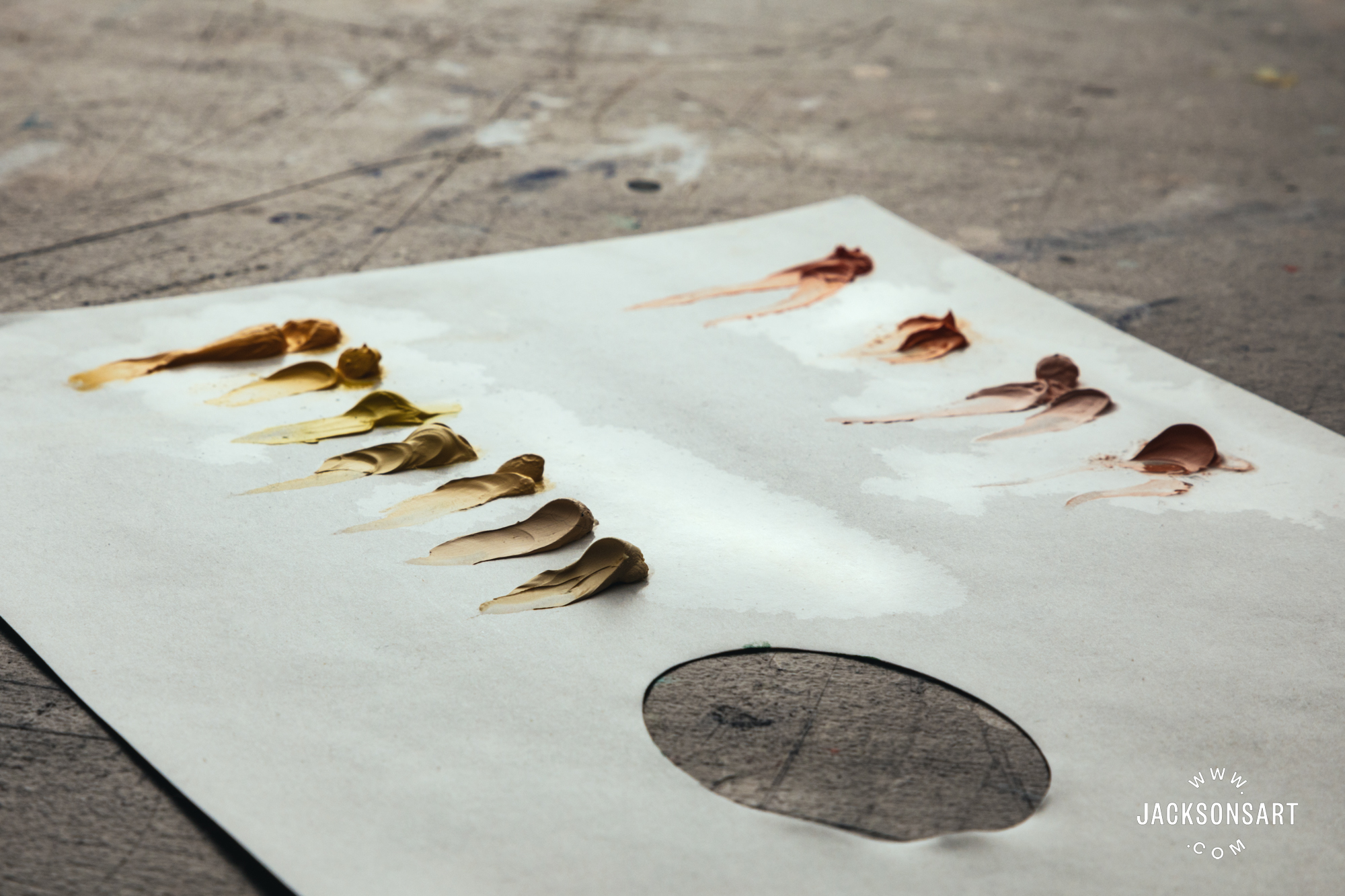
The viscosity and the drying times are variable by colour, so I expect that this means they don’t add stabilisers to their colours to get them to all be the same texture, or driers to get them to all dry at the same time. That is often considered a sign of a professional-quality oil paint. About half the colours I used were dense, somewhere between stiff and buttery. I needed to use a medium to get them to flow off the brush. They mixed easily with my alkyd medium. Many colours were buttery with a small amount of oil separation at the first squeeze. Ultramarine Blue and Anise (a strong, semi-transparent, yellow green) had a bit more extra oil. Diamond Pink, Light Shell and Dark Shell were very stiff and it took some effort to squeeze them out of the tube.
The Diamond Pink on the right was very stiff and a thin layer was touch dry in five days. The Intense Pink on the left was much softer, though not too soft, with a small amount of oil separation and dried more slowly.
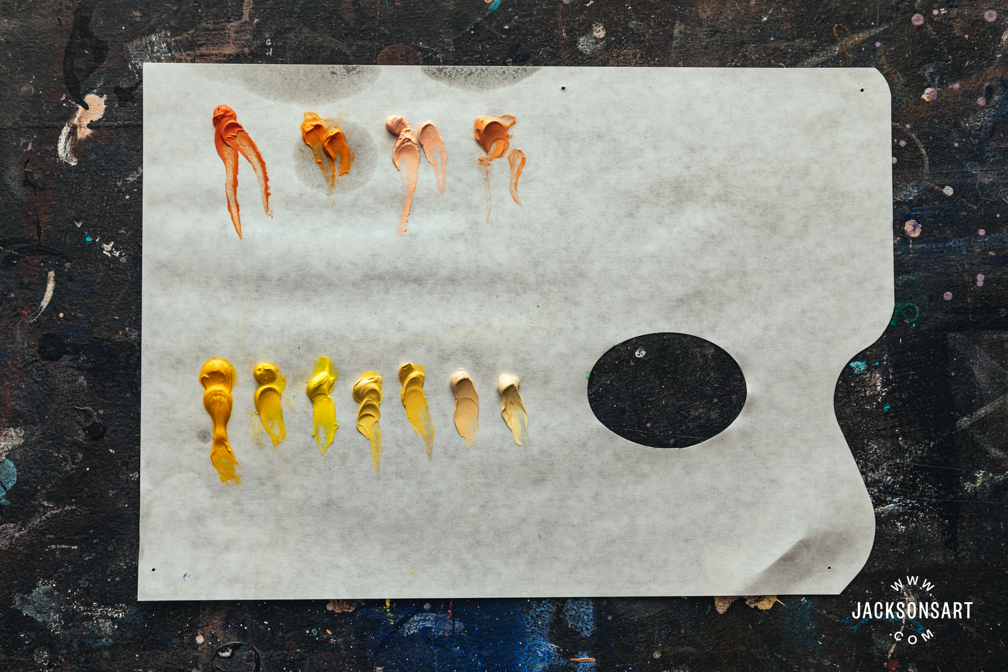
The oranges and yellows I had.
Most of these yellows and oranges were not stiff, and a bit oily as you can see from this side view of the palette.
The majority of the colours are a mix of two, three, or occasionally four pigments. To save space on the tube label, only the colour number of the main colour is listed on the tube. This means you will need to check the Jackson’s website or the Charvin website for the rest of the pigments in each colour, if you wish to know them. But since the purpose of knowing them is usually for colour mixing, you may not need to bother, since the strong point of these paints is that you use the colour straight from the tube with no mixing. (Many of the mixed colours are opaque pastel tints that must contain white, but white is not listed with the other pigments, which is a bit confusing.) Having the main pigment listed on the front of the tube is helpful for grouping colours by colour family, though. So all the colours based on PB29 are warm, slightly violet, blues, based on Ultramarine Blue. This helped me get my head around possible ways to organise the palette. I made quite a few colour charts but they didn’t give me as good of an understanding of how to organise these colours as realising I should group them in families.
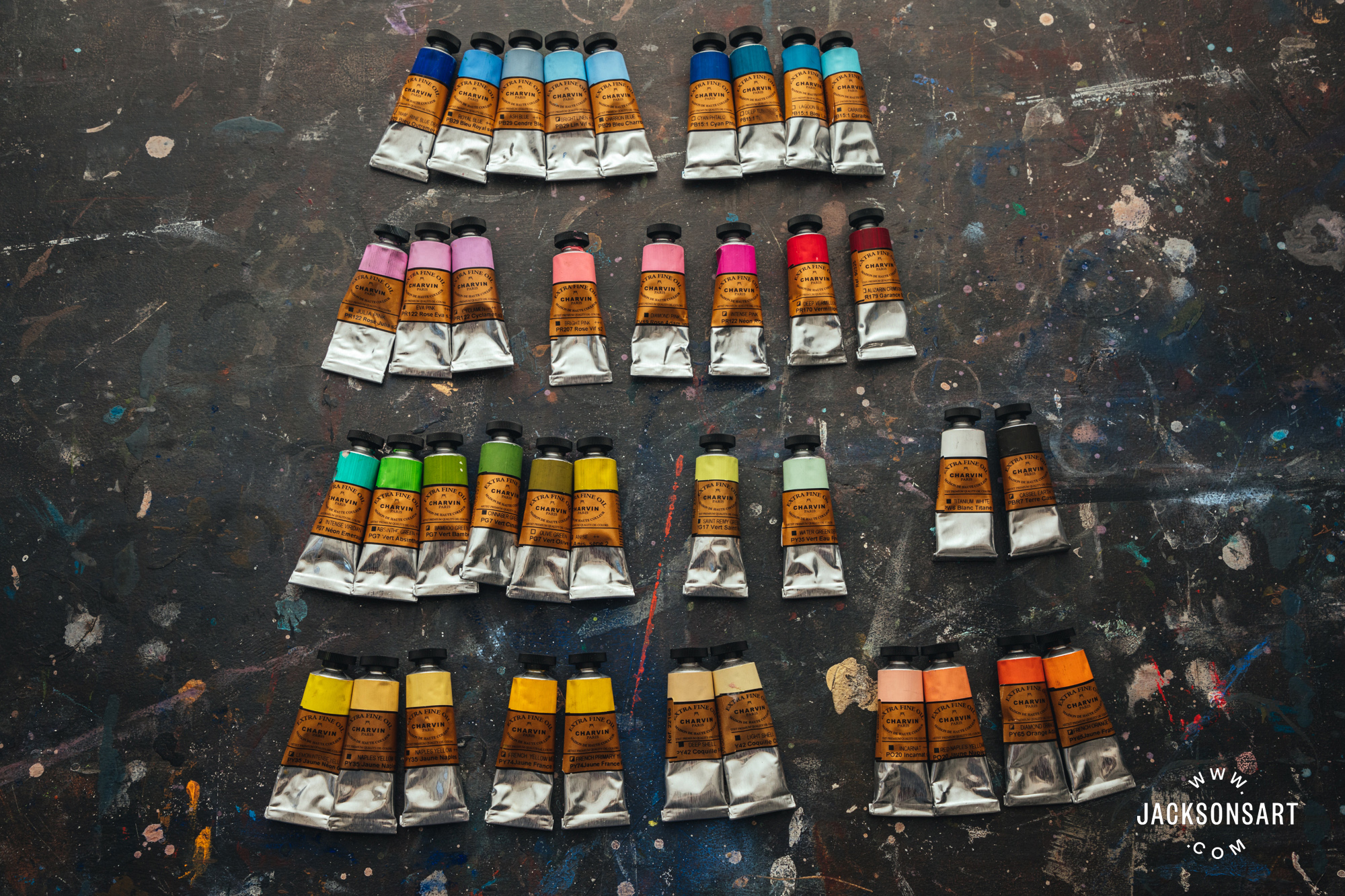
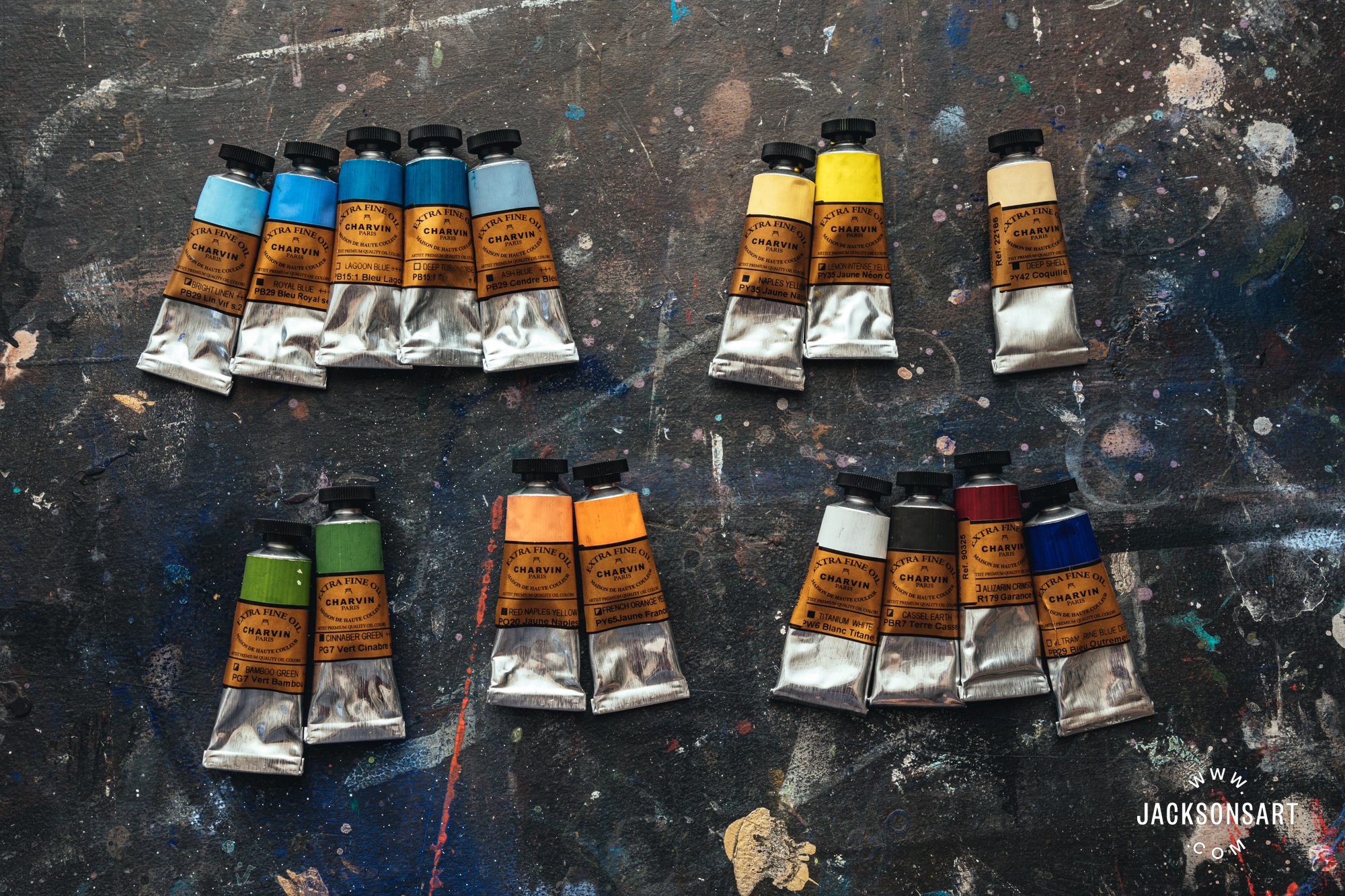
These are the colours I had in the 20ml tubes, here grouped by colour family. For instance the blues at the top left all have PB29 Ultramarine Blue as the main pigment and that is what is listed on the front of the label. And the large group of greens are all based on PG7 Phthalo Green.
Charvin say that they have designed their colour range to be close to the colours of nature, a wide range of colours already mixed to save the plein air painter some mixing time. And they recommend not mixing their colours together since you will then end up with six or more pigments in a mix which may grey the colour more than you intended.
Ways To Approach Colour Choices in Oil Painting
Since I normally paint using just a few colours that I mix to make lots of colours, I wasn’t sure how to best approach painting with the huge range of pre-mixed colours of the Charvin paints.
There are a number of ways to approach colour when you are oil painting. Two common methods are to use either an open palette or a prepared palette. An open palette means that you mix as you go and a prepared palette means that you pre-mix piles of all the colours you will need for that painting session. With an open palette one of the usual methods for selecting colours is to use a split primaries colour palette which allows you to mix any colour from just a few. For a prepared palette there are many ways to choose the colours that you will mix in advance. And there are many ways to work within these two systems including a hybrid of an open palette with some prepared colour piles on it.
The approach to colour mixing can also vary. You could use a prismatic colour mixing system with your split primaries palette which means you would darken or dull your green with a red not with black or grey. You might prepare your colour piles on your palette each having a string of values for creating lots of form or depth in the painting or you might prepare colours that match your scene and paint in patches of unblended colour.
Since Charvin oil paints have such a huge range of pre-mixed colours it seems like the strong point of this oil paint would be in the method of applying patches of unblended colour from a prepared palette. But I wanted to try an open palette as well to see how the paint handled.
Split Primaries Open Palette
If you were painting this way, you would be using the centre area of your palette for mixing, so you would lay out 8-14 colours around the edge of the palette – six split primaries (a warm and cool version of each of the three primary colours or eight if you subscribe to the four ‘visual primaries’ system which includes green, so you’d add a cool and warm version of green), plus white, some neutrals and maybe an extra blue and an extra red. From these you should be able to mix all the colours you will need. If you pay attention to the opacity when selecting your colours you can also get a range of opaque and transparent colours in your palette.
Since you are mixing, it is important to choose single pigment colours if you can, because they will be predictable in their mixing results. If I were limited to eight primaries I’d choose an azo red and a crimson, phthalo blue and ultramarine blue, lemon yellow and a cadmium yellow deep or Indian yellow, and viridian and phthalo green. Plus cobalt blue, magenta, burnt umber, and white. If I’m figure painting I find yellow ochre, terre vert and caput mortum helpful. For landscape painting a cool green like Viridian can help you get some nice dark greens when mixed with a bit of crimson.
For the split primary I used the standard six single pigment colours and white and burnt umber. To get a single pigment burnt umber I needed to choose the paint they call Cassel Earth, which is not the usual name for this pigment. I chose Cyan Phtalo, Ultramarine Blue, Alizarin Crimson, Vermillion, French Yellow Light and Dark, but in the future I would change to light vermillion and dark vermillion for my reds. Their Alizarin Crimson is made with one of my favourite pigments, Perylene Maroon, but isn’t the best choice for a split primaries cool red. There weren’t a lot of single pigment paints to choose from and the names of some of them were confusing – I was looking for a Burnt Umber but the paint labelled Burnt Umber was made of three pigments, to find just burnt umber I needed to use Cassel Earth, which is not the usual name for this pigment.
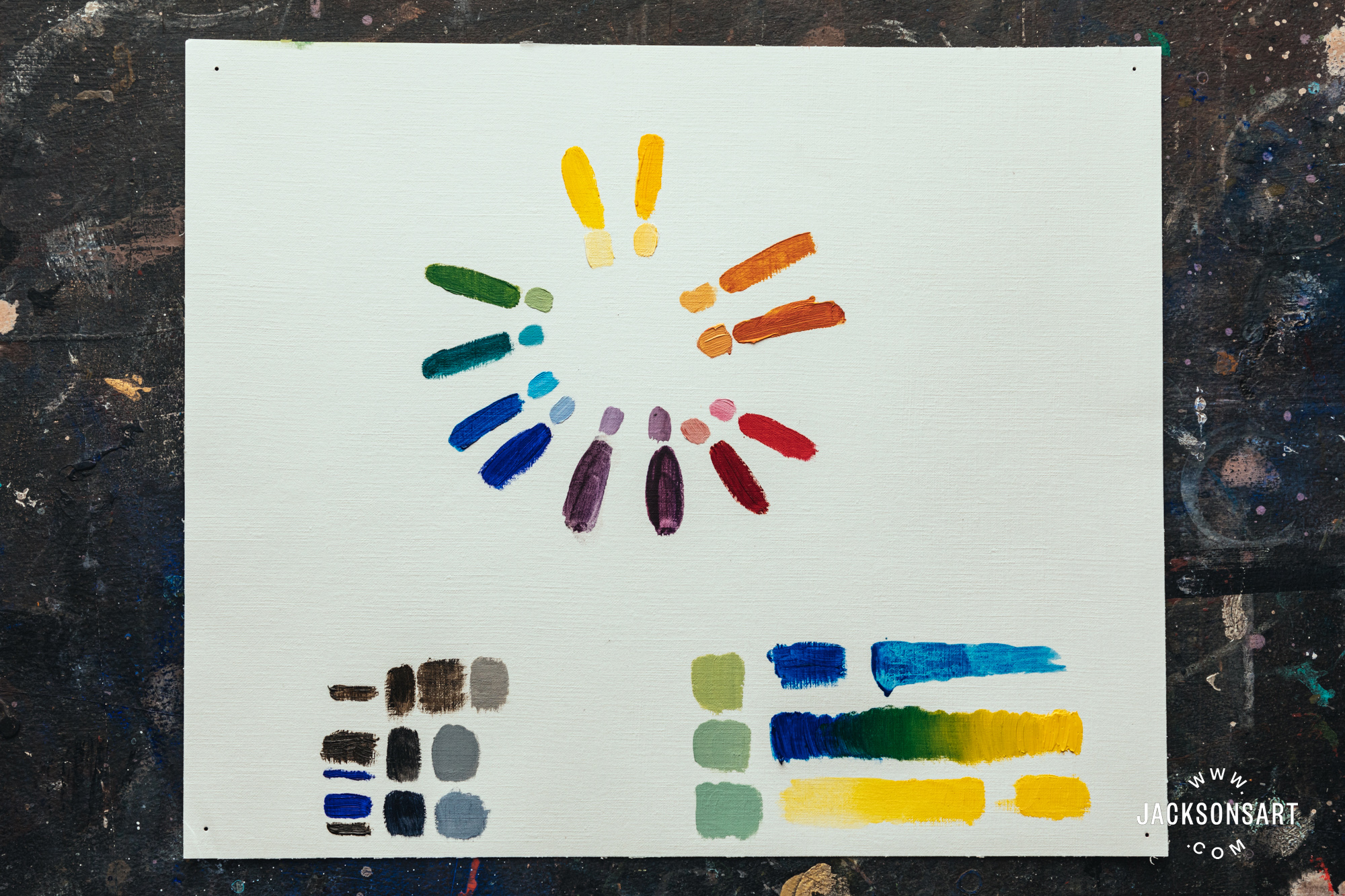
I painted a circle with the 6 split primaries and then used those to make 6 secondaries, and painted them on Jackson’s oil painting paper.
At the bottom left I made a warm black and a cool black and their greys, from different amounts of Ultramarine Blue and Cassel Earth (which is what Charvin call their Burnt Umber).
At the bottom right I mixed different amounts of the cool yellow French Primary Yellow and the cool blue Phtalo Blue to make a range of greens and then made pastel shades of a warm green, middle green and cool green by adding titanium white. Notice how much the titanium greys the colours when so much is used.
I made some colour charts and did a small painting using this method and the Charvin paints were fine. I also used an open palette using some of the mixed colours and trying to mix with them was frustrating. But I found the best way for me to get the most from the huge Charvin range was to paint with premixed piles of paint, straight from the tube with no colour mixing, without much blending on the canvas, just placing the colour in patches. This is where the Charvin paints really shine.
Prepared Palette – Pre-mixed Paint Piles
I thought of the huge range of colours that Charvin has, as being similar to having a huge palette of soft pastels. I arranged colours in rows of each hue with a gradation in value from darkest to lightest, and most saturated to greyest.
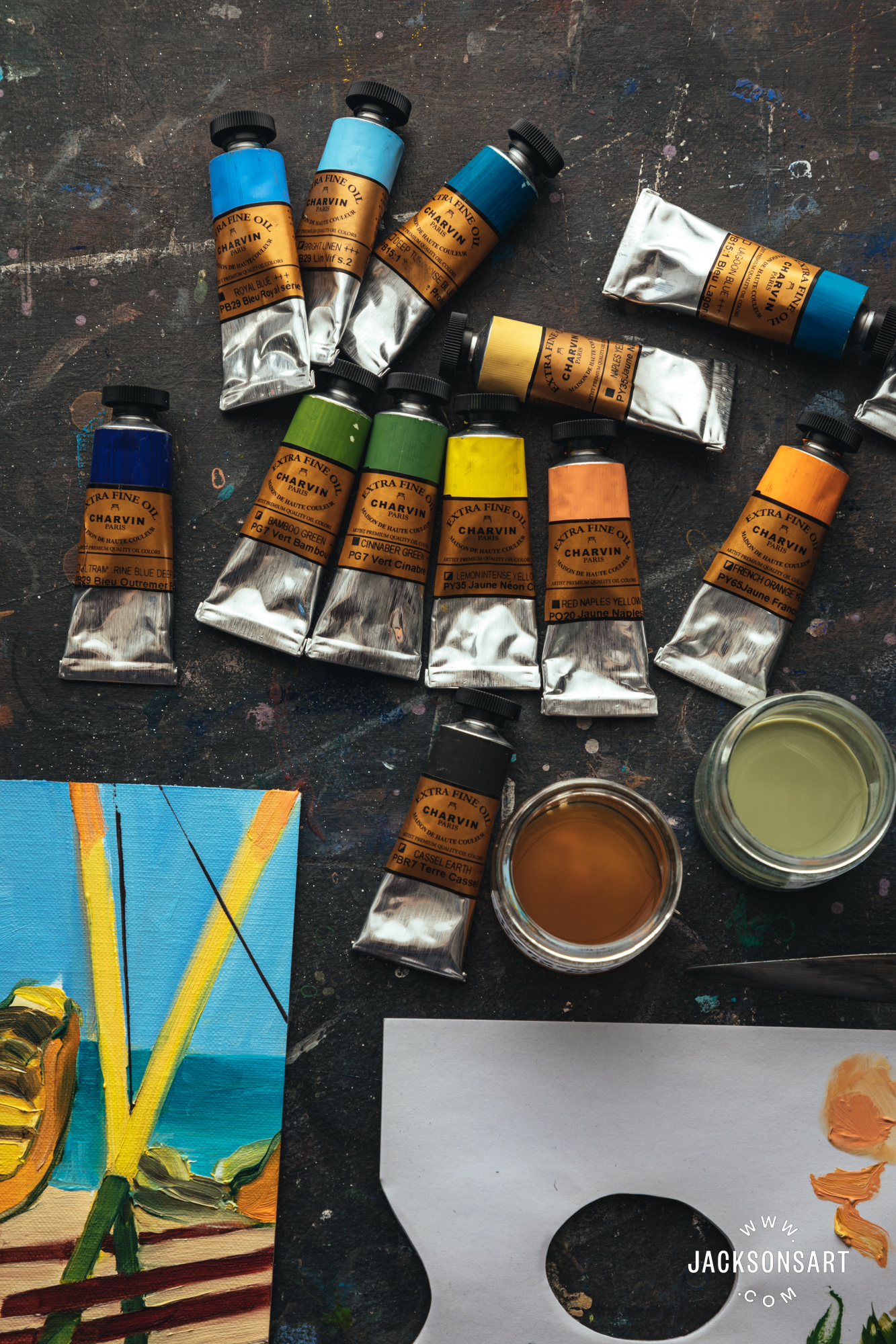
These are the colours I used for the test painting.
To trial these paints I made a small painting using a reference photo that I took at the seaside a few weeks ago. It was an unusual process for me to select my colours rather than mix them. Painting this way meant that I had to have a plan and stick to it. As I paint, the subject opens up for me and I see more things in it, and colour relationships and values get more accurate the longer I look and try things and change them and start to see properly. So I started with three blues but added two more later to better represent the sea and sky and I added Ultramarine (a single pigment colour) to mix a purple. But the Lagoon and Deep Turquoise were similar enough that I realised I didn’t need them both for this painting. I also used two oranges, two bright yellows, a very pale yellow for the sand (Deep Shell), two greens, red, brown and white – a total of 15 colours. Like the Ultramarine, the red and brown were also single pigment colours that I used to mix some darks. I mixed four clean colours from single pigment colours, because I didn’t have those colours in my selection. But I then also treated them as paint piles to not be mixed. I hardly used any of the white, which is unusual for me.
Making a small test painting, with almost no blending on the canvas.
I used six brushes – all Jackson’s Akoya – filberts in sizes 2, 4, 6 and flats in sizes 2, 4, 6. One of the keys to painting this way is to keep wiping your brush clean and it helps to have a few brushes so you can have at least one for each hue group (yellows, blues, pinks, etc.). I rinsed my brushes in Pure-sol and wiped them often.
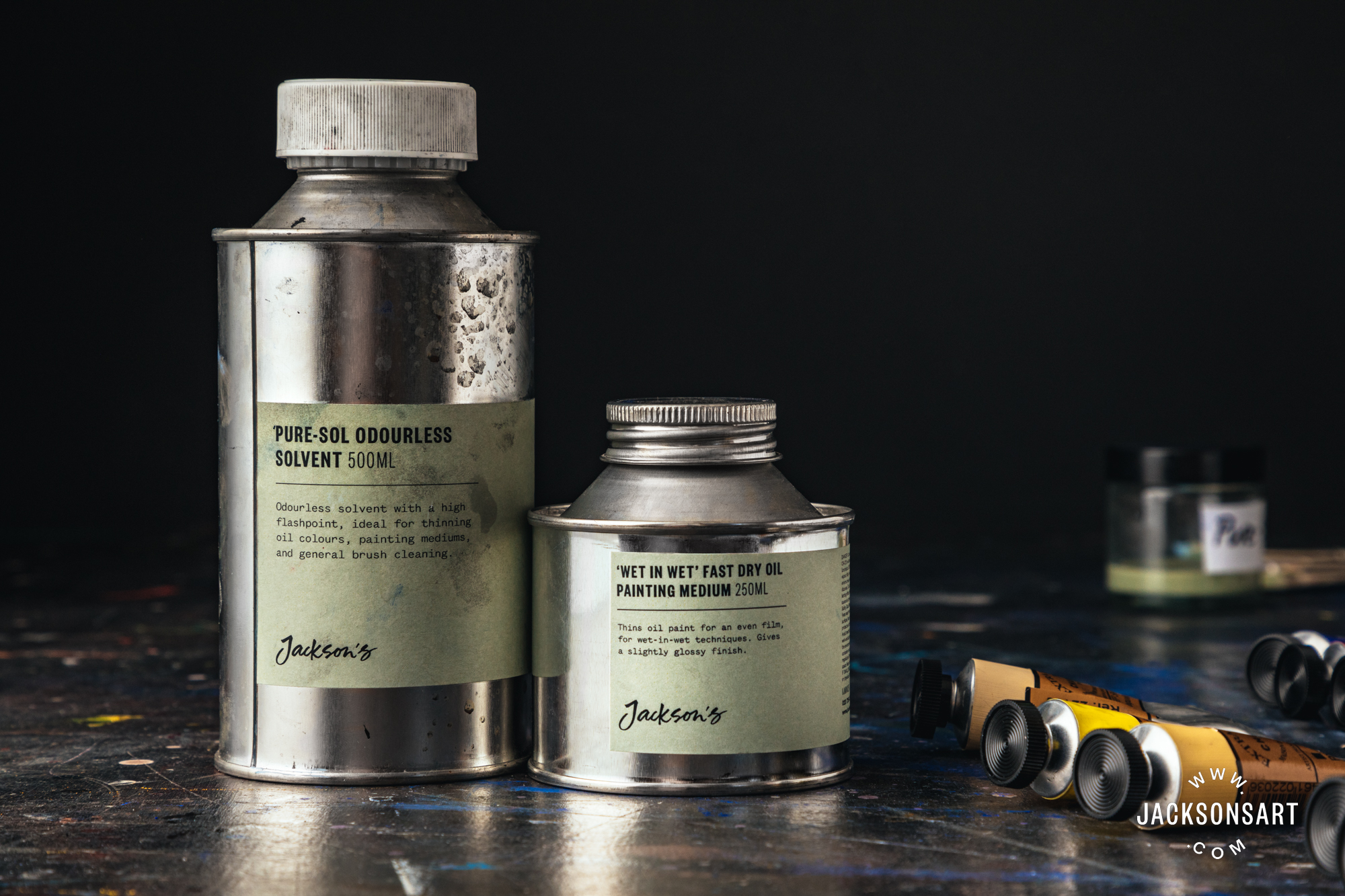
I used Pure-Sol for brush cleaning and Jackson’s Wet-in-Wet medium to make the stiffer paints flow.
One of the advantages of oil paint is that it will wipe off the canvas while you are painting, that the removal of paint is just as important a part of the process as adding paint. So it was good that Charvin wipes away well, which was important for keeping clean colours. If I needed to change the colour of an area, I wiped away the colour I didn’t want and replaced it with the new colour. Painting over the previous colour worked when modifying the sky and the sand, but everything else I tried this with made it too muddy, so I had to do some wiping away.
I did blend in one place on the canvas – the line between the shallow and the deep sea colours. I painted over paint successfully twice: Light Orange on top of the sand in the foreground and Royal Blue over the Bright Linen to get the sky value right. Because they were close colours they blended beautifully.
At the end of a painting session using the open palette method, I usually have a very messy palette. But my palette after this painting was neat and tidy. I only mixed four colours that I didn’t have: dark purple for the swing support bars, dark green for the shadows on the green paint, red-brown for the wooden bars, and a transparent warm black for the cast shadows on the ground. You can see on my palette that I occasionally brushed a stiffer colour out with a bit of medium, I used Jackson’s Wet-in-Wet Fast Drying Medium. You can also see that I had to add more of the Dark Shell onto my palette a few times because I used a lot for the sand. I put a small amount of white on the palette and used it but I could have done without it so didn’t refresh it.
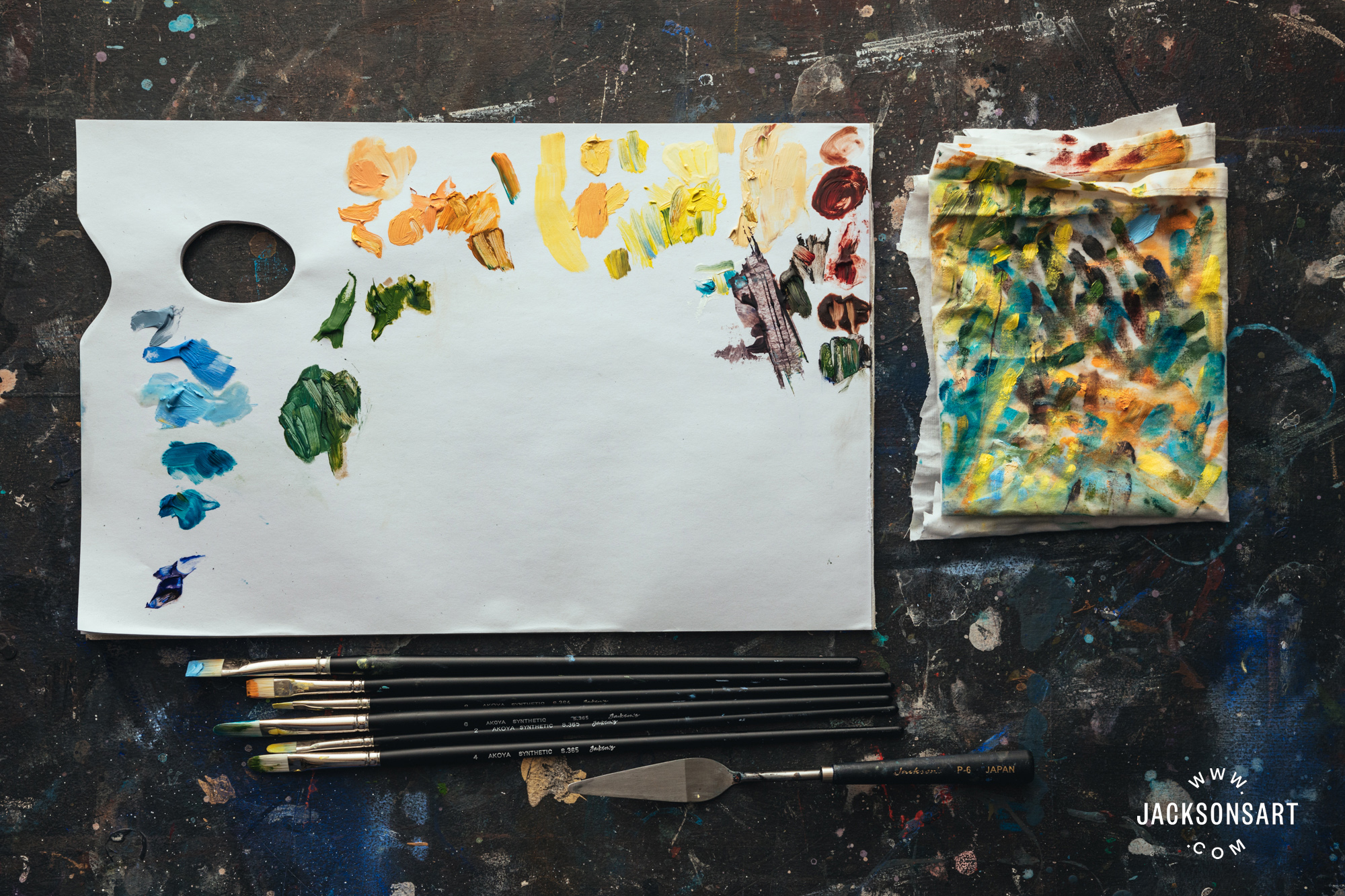
Because I did so little mixing, my palette was very tidy here, at the point when I am almost finished with the painting.
Notice how much wiping I did on my rag, to keep my brushes clean. My Akoya brushes are below the palette.
I had less than two hours to work on this painting and here it is nearly finished. I would like to spend about 15 minutes more just on the two central swing seats, refining the shapes a bit and getting the values of the shadows better and I noticed that I need to straighten my horizon line a bit. I liked working in this way, having to stick to these colours without mixing felt a little unusual at first but enabled me to continue on my path to the goal much more quickly and allowed me to concentrate on the shapes and value relationships and I really enjoyed it.
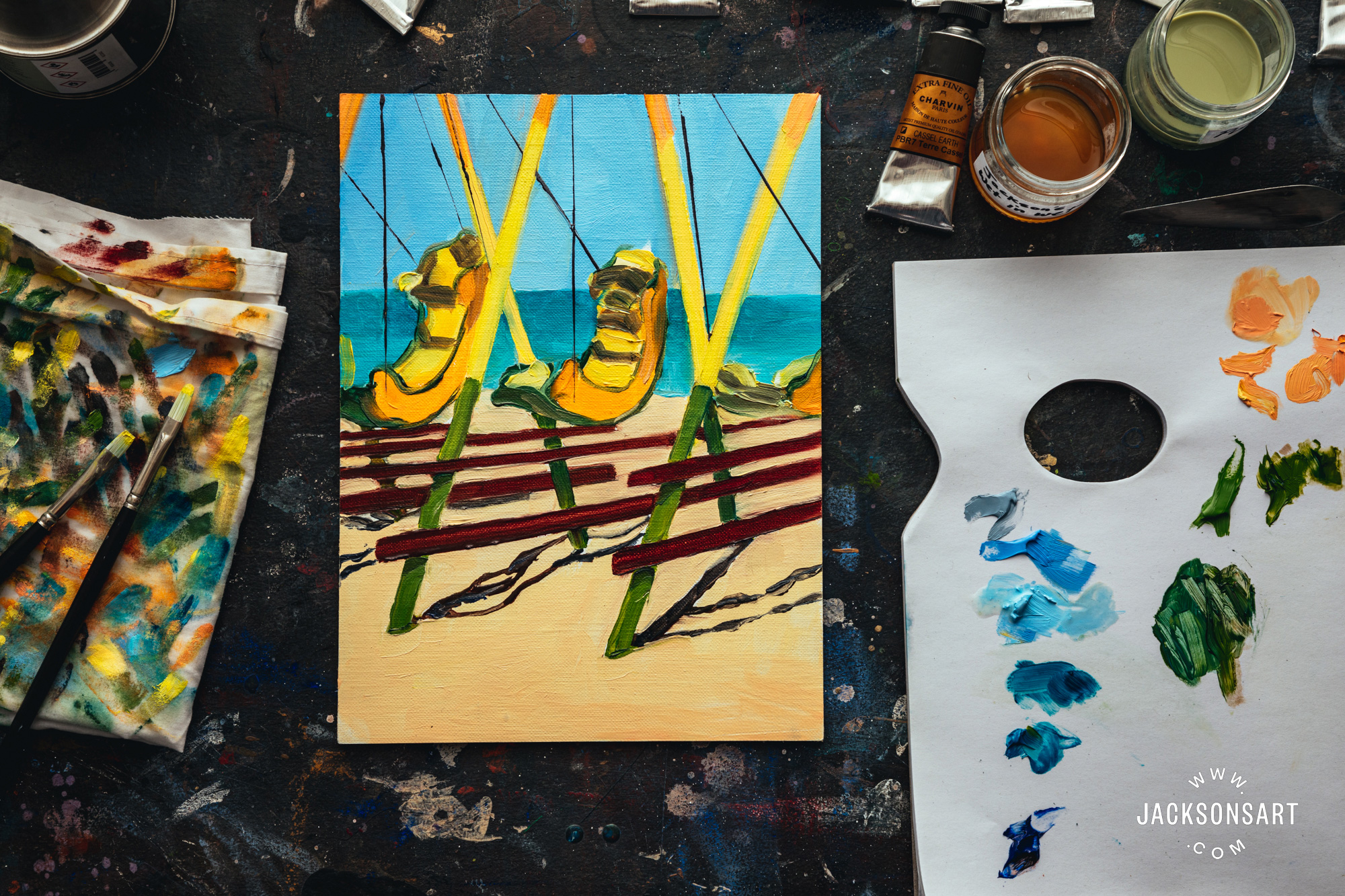
My nearly finished painting of seaside swings using Charvin Oil Colours on a Jackson’s Handmade Linen Board.
Conclusion
I think the Charvin oil paints would be especially useful for painters of high-key, light-filled, impressionist landscapes, where daubs of paint are placed and then not blended or for contemporary painters who use a prepared palette and don’t do much blending on the canvas. I really liked them when used this way. Even if you use an open palette you might find it useful to add a few special mixed colours to your palette. Some of the comments I have read from artists who love the Charvin paints are: ‘consistent, clean colours’, ‘less time spent mixing colour and more time painting’ and ‘using their premixed colours makes for fast, consistent colour.”
Size of Tubes
All of the colours come in two sizes, the smaller-than-usual 20 ml tubes which are ideal for plein air painting or trying a colour, and the larger-than-usual 60 ml size. The blacks and whites also come in extra large 150 ml tubes.
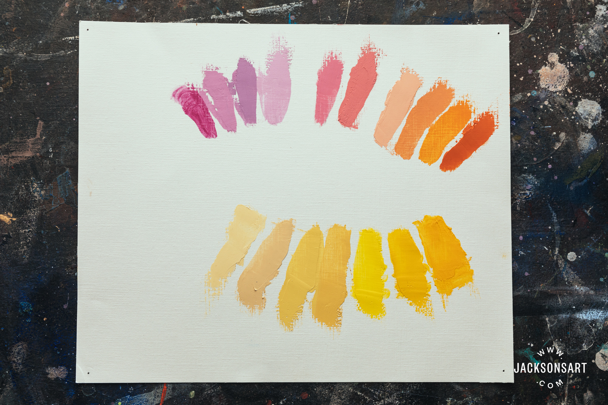
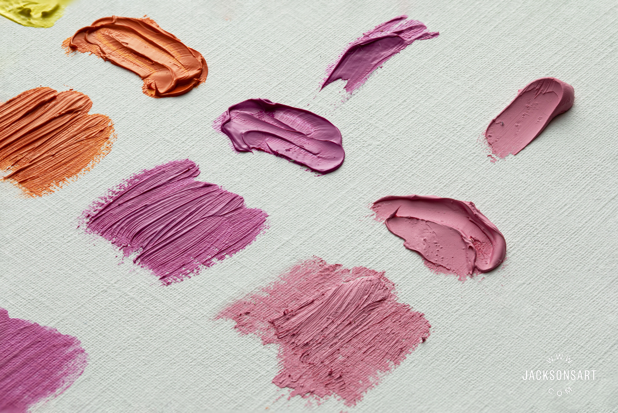
The Charvin pinks, oranges and yellows I was using, just a small part of their range.
Top row L-R: Intense Pink, Julia Pink, Cyclamen, Eva Pink, Diamond Pink, Bright Pink, Incarnat, Red Naples Yellow, French Orange, Diamond Orange.
Bottom row L-R: Light Shell, Deep Shell, Naples Yellow, Naples Yellow Gold, Lemon Intense Yellow, French Primary Yellow, French Yellow Deep,
Materials
Further Reading
A Guide to Oil Painting- What You Need to Get Started
Frances Featherstone Experiments with Jackson’s Oil Painting Mediums
Creating Oil Paintings That Stand the Test of Time
A Guide to Oil Painting Mediums
Shop Charvin Extra Fine Oil Paints on jacksonsart.com
Shop Oil Painting on jacksonsart.com


